
A website redesign project
The Outback Climbing Center (OCC) is a hidden gem of UC San Diego, where a close-knit community of climbers test their limits and ascend new heights. Our team was challenged to build a complete, mobile-friendly website and unique branding that encompassed all that the OCC had to offer.
TIMELINE: 8 Weeks
MY ROLE: Branding, UI/UX Design, Graphic Design
TOOLS: Photoshop, Invision
TEAM TENK-Q: Tina, Evellyn, Nicholas, Kimberly (The ‘Q’ is for quality ☻)
Design Process

Define
OBJECTIVE
When first visiting the website, it was clear the OCC lacked distinction from other UCSD Recreation facilities. All information was located in a single tab and their branding was virtually non-existent.
We sat down with our clients, including the OCC Director, Student Manager and Head Route Setter, to clearly define their objective for this project:
Strengthen our on-campus presence
Deliverables included:
A complete rebrand that was reflective of their beloved community
A website redesign that catered to newcomers + potential members
Clearer marketing of their services, location, and community events
“We want it to look more professional, rather than a college dirtbag gym.”
Empathize
User Interviews
We interviewed a total of 12 users (I interviewed 4). All but one user were current UCSD students with varying levels of climbing experience.

Disclaimer: My current views on gender have changed since taking on this project during my undergrad.
From this, we discovered these key takeaways:
Users felt more inclined to try any new sport when with friends.
Current climbers described the OCC community as friendly + welcoming to all. Previously, we also noted that our client took pride in being run by students, for students.
A majority of users found out about the OCC through word of mouth marketing.
Current climbers loved the frequent route resets to the gym’s walls but had issues with their website’s inaccurate Google calendar.
Potential climbers found it difficult to locate the gym, while one current climber noted the horrible directions provided on the website.
Personas
Based off our interviews, we then created 3 distinct personas:


User Scenarios + Use Cases
Together, we brainstormed 7 different user scenarios, compiling a summary of their use cases, the personas applicable, and website features needed.
Learning About Events
Using a Pass
Booking the Gym
Participating in Climbing Competitions
Trying out OCC as Another Climbing Gym
Trying Climbing for the First Time
Renting Equipment


SUMMARY
Our target audiences were clear. We were designing for first timers, which included Non-OCC and Potential Climbers. To guide our redesign, we asked ourselves:

After carefully considering our client’s objectives, user needs, and the constraints of our 8-week project, we ultimately concluded these goals for our website:
Attract first timers with a seamless sign-up process
A ‘Meet The Staff’ page that reinforced human connection + community to its users
Highlight social media to keep users informed about the OCC
Clear marketing on their frequent route reset schedule
Better directions to help newcomers locate the gym
Research
Competitive Analysis
As a team, we analyzed websites for different climbing gyms in San Diego, including ones that were mentioned during our interviews: Vertical Hold, Grotto and The Wall. We gained inspiration for:
Branding
Website Functionality
Content
Site Architecture
Mobile Friendliness
BRANDING + Mood Boards
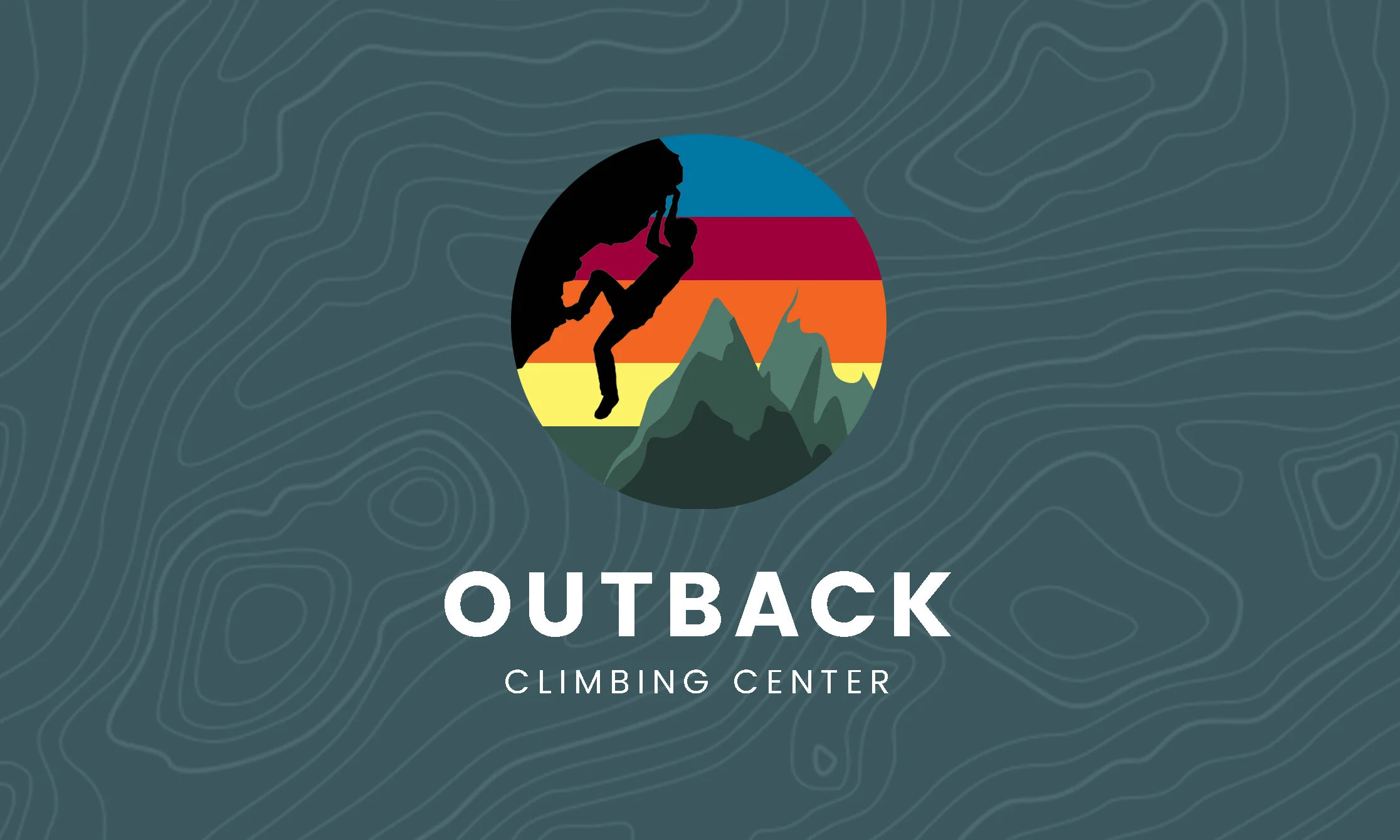
My most impactful contribution was rebranding the OCC (more that on later).
I gathered inspiration from other outdoorsy brands such as REI, Patagonia, and Outside Lands. I wanted to portray the OCC for what it was and how members described them: a vibrant, adventurous and welcoming community that invited folks from all walks of life.

Mood Board compilation of fonts, logos, color palette, imagery and graphic elements.
Ideate
Site Architecture
Together, we referenced our use case summary and features table (above) to construct our site architecture, which later guided our sketches. As part of the assignment, we also focused on our website’s mobile friendliness.

Sketches


Prototype
Wireframes
I created the lo-fi, then hi-fi wireframes using Photoshop and images pulled from Google. My team later helped to link the individual pages and create our prototype on Invision.
Note: Only a 4 out of 8 pages are displayed below.


Development Plan
Once we finalized our wireframes, we developed a project tracking sheet to assign clear roles and ensure our progress for our website.
CONTENT
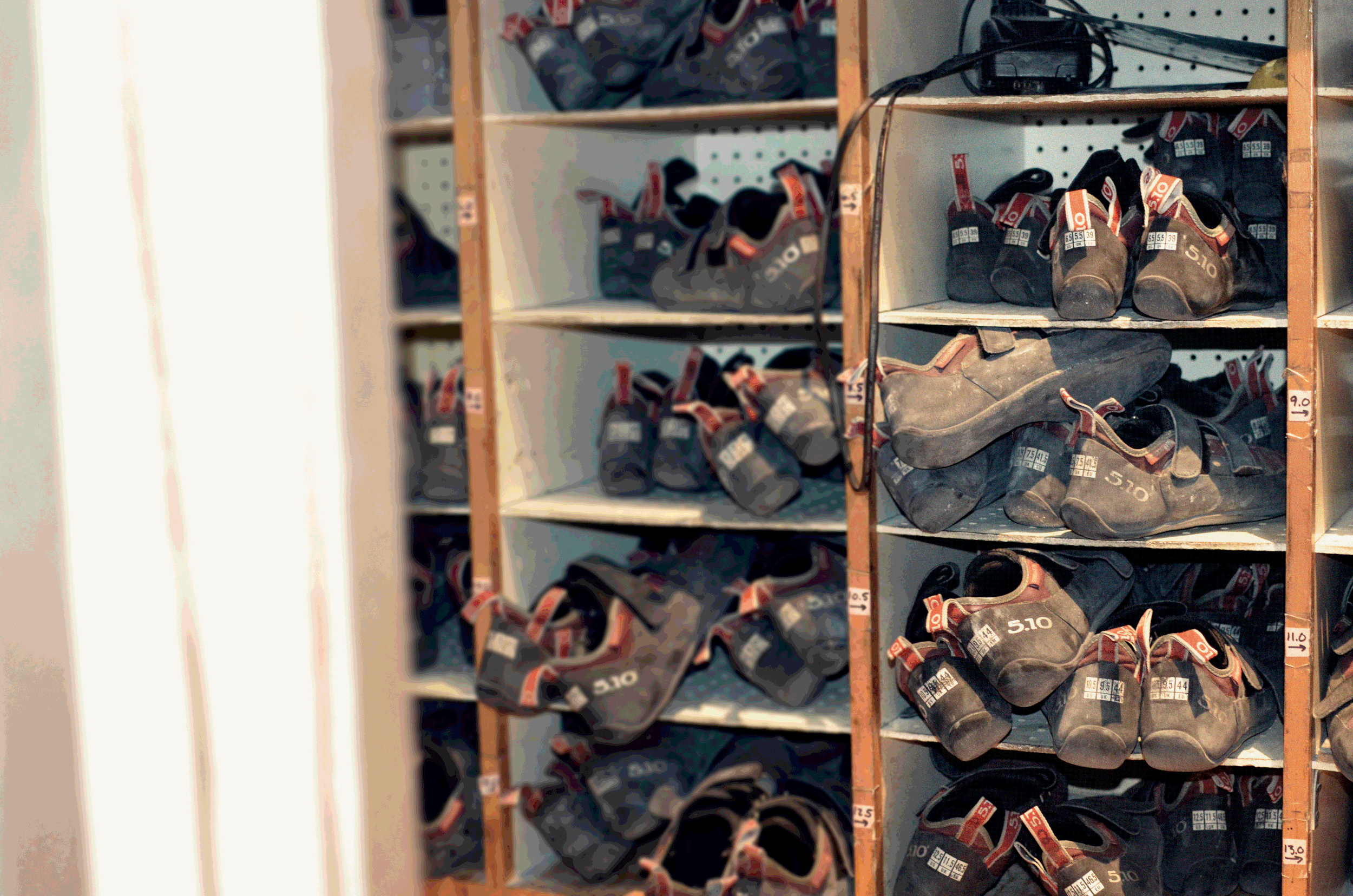
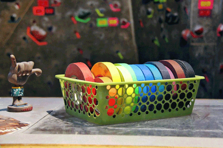
During the development phase, I was in charge of: photos, graphics (wall, map, misc.), and the OCC logo. One roadblock we faced was the lack of content to display on our website. So, I saw it as opportunity to practice my camera and photo editing skills. ✌️


As a new visitor to the gym, I got to personally experience the OCC ambience and community there. From the moment I walked in, I was immediately drawn to their mural that was brilliantly displayed behind their main wall. An AHA! moment I’ll never forget…
I was shooting at the facility for nearly an hour. I watched as climbers would scale the routes and was intrigued by the support and teamwork amongst its members. My eyes repeatedly looked back to the mural. It was clear to me that its art was reflective of everything the OCC community had to offer. Its vibrant colors and imagery portrayed a sense of adventure and welcoming to all climbers, ready to be challenged and ascend new heights.
If I hadn’t visited the facility, I would’ve never gained inspiration for designing the official OCC logo.


Results
After 8 challenging weeks, we finally brought our redesign to completion.
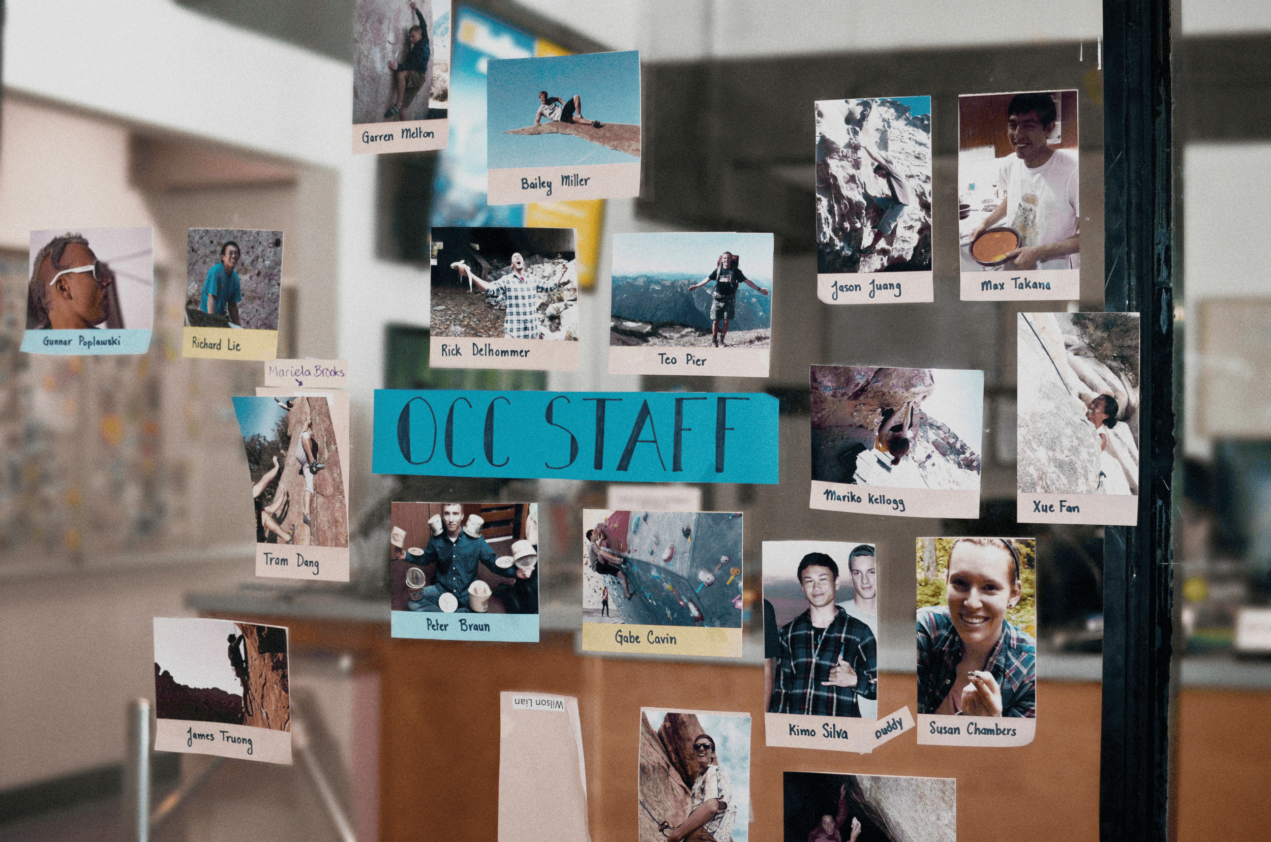
While we weren’t able to sell our product to our client, the OCC was nonetheless thrilled by the results. The members especially enjoyed seeing their fellow friends on the Meet The Staff page — a true reflection of their community culture.
We were proud to showcase our work during final presentations and our website was highly-received by both the Instructor and 4 Instructional Assistants. In fact, we were complimented on designing one of the best websites amongst the 12 total teams.
My favorite comment regarding the wall graphic I designed and our team’s innovative solution for clearly marketing the OCC’s frequent route resets:
“To be honest, other competitors should be taking your wall feature as inspiration for their own websites.”


This graphic represents different walls offered at the OCC gym and their next route reset date (not shown).
Reflection
To date, the OCC Redesign remains one of my proudest works. If I given the opportunity to expand on this project, my next steps include:
Perform user testing with Potential + Non-OCC Climbers, using the Think Aloud Method to pinpoint any user flow discrepancies when signing up as a first timer
Refine the visual + UI design of each page, keeping in mind the negative space, font sizes, type overlays and banner photos needing to be optimized for the best mobile and desktop displays
Implement subtle animation and motion design to bring life to the website and create a delightful experience for users visiting the site
Throughout this process, I learned what it took to redesign an entire website and collaborate in UX/UI team. I recognized the cooperation and communication required from all members to work productively and hold each another accountable. I was also reminded the importance of empathy and putting ourselves in our users’ shoes to gain better clarity of their unique experiences. Best of all, this project challenged me artistically, developing my skills in both graphic design and branding.
In the end, my team and I put our hearts and souls into redesigning the OCC website and I am beyond pleased with the results.

Mountain graphic used as background imagery throughout our website redesign.
Other projects
I’ve worked on design projects ranging from website, mobile app, lettering, and illustration.